
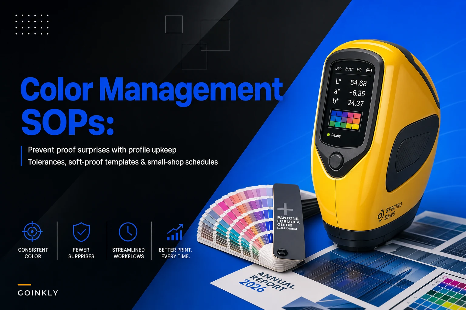

The proof surprise almost never comes from the press. It comes from a stale profile, a monitor nobody calibrated since March, or a signoff sheet that said "colors approved" without defining what "approved" even meant. By the time the client is holding a mismatched swatch under their office fluorescents, the argument is already unwinnable — because there's no documented tolerance to point to.
Small shops get hit harder than big ones. A commercial printer with a dedicated color department can absorb a bad batch. A four-person shop running short runs of 250–500 pieces eats the reprint, the shipping, and the relationship damage all at once. And the maddening part is that most of these surprises are procedural, not technical. The equipment is fine. The SOP is missing.
So this is about the boring stuff that prevents the drama: when profiles get rebuilt, how soft-proofing gets standardized so two operators produce the same preview, what delta values you actually accept versus reject, and the exact signoff language that stops "that's not the blue I approved" three weeks after delivery.
Why proof surprises are almost always a documentation gap
When a shop gets a color complaint, the owner's first instinct is to check the press or blame the paper lot. Sometimes that's it. But far more often, the failure traces back to one of three undocumented decisions:
-
Nobody knows when the ICC profile for that stock was last validated
-
The operator soft-proofed on a monitor that hadn't been calibrated in months, or with the wrong rendering intent
-
The client "approved" a proof under conditions nobody controlled — their laptop, their lighting, their expectation of "brand blue"
None of those are equipment problems. They're gaps in what should be a written, repeatable procedure. A color management SOP isn't a fancy document — it's the set of rules that makes color reproducible across operators, shifts, and months. When it's missing, every job is quietly a gamble, and you only find out you lost on the runs that matter.
The thing most owners miss: color drift is gradual and invisible until it crosses a threshold. Your press doesn't suddenly print wrong. It creeps. A profile built in January is subtly off by June because the ink lot changed, the paper supplier substituted a slightly brighter sheet, and pressroom humidity shifted. Without a maintenance schedule, you don't catch the creep — you catch the complaint.
The profile maintenance schedule (the part everyone skips)
Most shops build a profile once, name it something like MattePaperFinalv2, and treat it as permanent. It isn't. Profiles decay because the physical conditions they describe change. The fix isn't constant re-profiling — that's overkill for a small shop. It's a predictable cadence tied to the things that actually shift.
Eliminate order confusion and delays.
GoInkly helps you manage every print order efficiently from submission to delivery.
- Centralized order tracking
- Production workflow management
- Inventory and supply monitoring
No credit card required
Here's a maintenance schedule that fits a small operation without drowning it in calibration work:
| Task | Frequency | Trigger that overrides the schedule |
|---|---|---|
| Monitor calibration (soft-proof stations) | Every 2 weeks | New monitor, ambient lighting change, OS/display update |
| Press linearization check | Monthly | Head replacement, major service |
| Full ICC re-profile per stock | Quarterly | New paper supplier or lot, new ink lot, visible drift |
| Reference print vs. saved target | Weekly (quick check) | Any customer color complaint |
| Profile inventory audit (what's current, what's stale) | Monthly | — |
The weekly reference print is the cheapest insurance in the whole system. Print a known target — a small chart with your critical brand colors, skin tones, and neutrals — and compare it to a saved master under controlled light. Takes five minutes. If it drifts, you catch it on a Tuesday instead of on a client's 800-piece run.
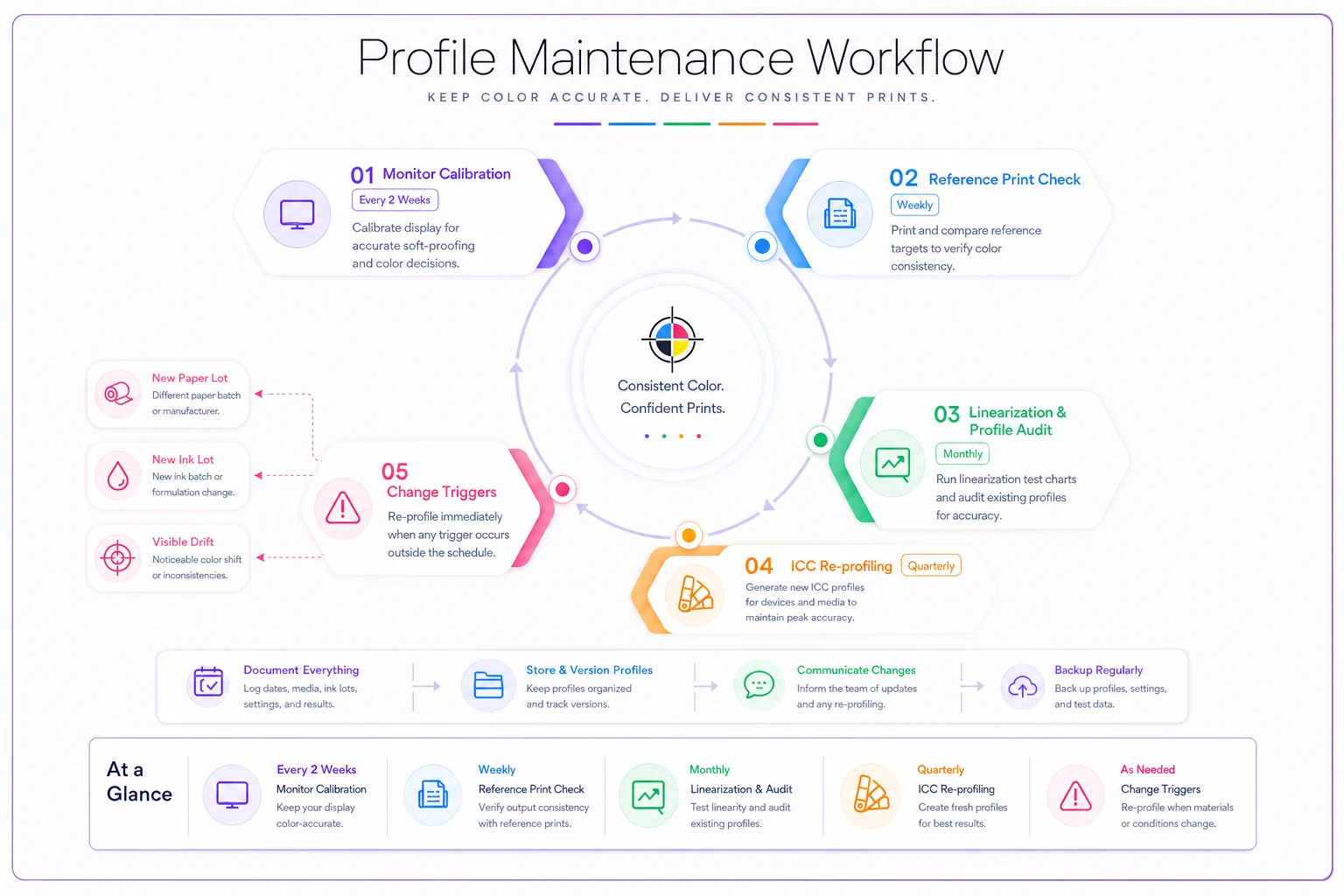
The profile inventory audit matters more than people expect. In real shops, profiles accumulate into a graveyard: Glossnew, GlossnewFINAL, Glossusethisone. When an operator grabs the wrong one at 4pm on a Friday, that's your proof surprise. Part of the SOP is simply that every profile has a clear active/retired status and a build date, and retired ones get moved out of the working folder so nobody picks them up by accident.
Use an 'active' and 'retired' folder convention and include build dates in profile filenames so operators can't pick stale profiles.
When quarterly re-profiling is overkill
Not every shop needs the full quarterly cycle. If you run a narrow set of stocks — say two papers and one substrate — and your suppliers are stable, stretching full re-profiling to twice a year is reasonable as long as the weekly reference checks stay clean. The schedule is a default, not a religion. The override triggers are what actually protect you. A new paper lot should prompt a check regardless of what the calendar says, because that's the single most common source of sudden color shifts on short runs.
Soft-proofing templates so two operators see the same thing
A recurring problem in small shops: one operator soft-proofs a job and it looks fine, a different operator opens the same file and something looks off, and now there's a disagreement about a proof before it ever reaches the client. That's not a skill gap. It's an environment gap.
-
The output profile being simulated (matched to the actual stock and press condition, not a generic default)
-
Rendering intent — pick one as the shop standard (relative colorimetric with black point compensation is a sensible default for most commercial work) and document when perceptual is used instead
-
The proof condition / simulation profile so gamut warnings actually mean something
-
Monitor white point and luminance set to the same values on every soft-proof station
-
Ambient lighting at the station — a hood or controlled overhead, not a window that changes with the weather
The mistake shops make is treating soft-proofing as "look at it on the screen." Two screens, two operators, two impressions of the same file. Once viewing conditions are written into an SOP and stations are set up identically, soft-proofs stop being a matter of opinion. This kind of standardization is the same logic behind building a repeatable end-to-end production workflow — the color step is just one node that has to behave the same way every time, regardless of who's running it.
Acceptable-delta matrices: define "close enough" before the argument
This is the section most shops don't have and desperately need. When a client says "that's not the right color," you need an objective answer: how far off is it, and is that within your stated tolerance? Without a delta matrix, every complaint is a negotiation — and you usually lose. Delta E (ΔE) is the standard measure of color difference. Roughly: ΔE around 1 is barely perceptible to a trained eye, 2–3 is noticeable on close comparison, and above 5 is obvious to most people. The trick for a small shop isn't chasing ΔE of 1 on everything — that's expensive and unnecessary for a lot of work. It's setting different tolerances for different color categories and writing them down.
A practical acceptable-delta matrix looks like this:
| Color category | Target ΔE (max) | Notes |
|---|---|---|
| Brand / spot colors (logo) | ≤ 2.0 | The colors clients notice first |
| Skin tones | ≤ 3.0 | Perceptually sensitive |
| Neutrals / grays | ≤ 2.5 | Casts show badly here |
| General CMYK imagery | ≤ 4.0 | Reasonable for short runs |
| Large solid backgrounds | ≤ 3.0 | Big areas amplify small differences |
The point isn't these exact numbers — your shop, press, and client base determine the right thresholds. The point is that they exist, they're measured with an instrument rather than an eyeball, and they appear in your client-facing documentation. When you can say "your brand color measured ΔE 1.6, which is inside the ≤2.0 tolerance you approved," the conversation ends. When you can't, it doesn't.
Worth noting operationally: a shop's tolerances should connect to how you track quality overall. If you're already watching reject and rework rates as part of your operational KPIs and capacity model, color-out-of-tolerance is a natural metric to fold in. A rising ΔE trend on your weekly reference print is an early warning that something upstream is drifting — well before it becomes a batch of client complaints.
Client signoff language that actually protects you
This is where short-run shops lose money quietly. A client approves a proof over email — "looks great, go ahead" — and the signoff says nothing about tolerance, viewing conditions, or the difference between a soft proof and the printed result. Then the piece arrives, the client compares it to a Pantone chip under their office fluorescents, and you're eating a reprint.
-
What kind of proof this is — a soft proof (on-screen) versus a contract hard proof are not the same promise, and clients need to know which they're approving
-
The tolerance you're committing to — reference the delta standard in plain language ("colors will match the approved proof within our standard tolerance")
-
Viewing condition disclaimer — colors viewed on an uncalibrated screen or under variable lighting will differ, and that difference is not grounds for a reprint
-
Spot color handling — if a Pantone is being simulated in CMYK, say so explicitly, because that's the single most common surprise on brand jobs
-
The approval is final for color once signed, barring a measurable out-of-tolerance result
A short version that works on small jobs reads something like: "By approving this proof, you confirm the color, layout, and content as shown. On-screen proofs are a close representation, not an exact color match; printed results are guaranteed to match the approved proof within our standard color tolerance. Pantone colors reproduced in CMYK are simulated and may vary." Plain, honest, and it draws the line before the job runs rather than after the complaint lands.
The behavioral part: clients don't dispute color because they're difficult. They dispute it because they had an expectation nobody set. The signoff isn't a legal shield first — it's an expectation-setting tool. Most of the reprints you prevent come from clients who now understand what "approved" actually means.
A short real scenario
A five-person shop doing branded short-run packaging — mostly runs of 300 to 600 pieces — was reprinting roughly two to three jobs a month over color complaints. Not catastrophic individually, but each reprint cost material, press time, and a rush turnaround, somewhere around $200–$500 once everything was counted, plus the relationship friction that's harder to put a number on.
The root causes, once they looked: no monitor calibration schedule (their main soft-proof station hadn't been touched in over half a year), profiles built for a paper their supplier had since changed, and email approvals with zero tolerance language.
They didn't buy new equipment. They put in a two-week calibration cadence, a weekly reference print against a saved master, re-profiled their two main stocks, cleaned out the stale profiles, and rewrote their approval email with the tolerance and viewing-condition language above. Within a couple of months the color-driven reprints dropped to roughly one every other month, and the ones that remained were genuine measurable misses they caught on the reference check rather than surprises the client found first.
The outcome that mattered most wasn't the saved reprint cost — it was that color stopped being an argument. When a question came up, they had a measured number and a signed tolerance to point to.
Where to start if you have none of this
If your shop is running on tribal knowledge and eyeball proofing, don't try to install the whole system at once. The order that gets you the most protection fastest:
-
Calibrate your soft-proof monitors and set a recurring reminder. Cheapest, highest-impact single change.
-
Add the weekly reference print. Five minutes that catches drift before clients do.
-
Rewrite your proof approval language with tolerance and viewing-condition lines. Zero cost, immediate protection.
-
Audit and clean your profile folder so nobody grabs a stale one.
-
Build the delta matrix and start measuring complaints against it instead of arguing.
-
Set the re-profiling cadence last, once the daily discipline is in place.
The reason this order works: the first three cost almost nothing and stop the most common surprises. The profiling work is more involved and pays off more slowly, so it comes after you've stopped the easy bleeding.
Color management isn't a technical mystery for most small shops — it's a maintenance and documentation habit that never got written down. The presses are usually fine. What's missing is the schedule that catches drift, the tolerance that ends the argument, and the signoff that sets the expectation before the run instead of after the complaint. Put those in writing, keep them current, and the proof surprises mostly stop showing up.
Ready to simplify your print shop operations?
Join 500+ print shops using GoInkly to save time, reduce errors, and improve customer satisfaction.