



Most print shops don't have a dashboard problem. They have a trust problem. The owner has a spreadsheet, the CSR has a different spreadsheet, the production lead has a whiteboard, and the accountant has QuickBooks — and when those four numbers don't agree at month-end, everybody quietly picks the version that makes their part of the business look fine.
That's why executive dashboards fail in small print shops. Not because owners can't read a chart. Because nobody agreed on where the number came from, who owns it, or what to do when it's wrong. So you get a beautiful dashboard nobody uses for decisions, because everyone already knows the underlying data is shaky.
This playbook is about fixing that in a way that survives an audit — meaning if your banker, your accountant, or a buyer ever asks "how do you know this revenue figure is right?", you have a clean answer with a paper trail behind it. We'll cover the KPIs worth putting in front of an owner, how often to reconcile them, who owns what, how exceptions get handled, and how each number maps to an actual decision.
Why print shop dashboards drift out of sync
The core issue is that a print shop runs on at least four disconnected systems of record, and each one thinks it's the truth.
You've got the quoting/order system holding "what we sold." Production tracking holding "what we actually made and when." Inventory holding "what we consumed." And accounting holding "what we got paid." In theory these tie together cleanly. In practice, a job gets re-quoted after a spec change and the order record never updates. A rush job jumps the queue and gets logged late. Someone eats a make-ready overrun and doesn't back it into job cost. A deposit lands but doesn't get matched to the invoice for two weeks.
Every one of those is small. But a dashboard is just arithmetic on top of those records — and arithmetic on top of inconsistent inputs produces confident-looking garbage. The dashboard looks more authoritative than the messy spreadsheets it replaced, which makes it more dangerous, not less, because people stop questioning it.
If your underlying data model isn't clean to begin with, no dashboard fixes that. This is why the single-source data model for orders, inventory and customers has to come first. A dashboard is a lens. If the glass is cracked, a bigger lens just magnifies the crack.
The executive KPIs actually worth a dashboard slot
Owners tend to overload dashboards with 30 metrics and then ignore all of them. The trick is separating executive KPIs (things an owner acts on weekly) from operational metrics (things a floor lead watches hourly). This article is about the executive layer. The deeper operational and capacity metrics are covered in the KPIs and capacity model every profitable print shop should track.
Eliminate order confusion and delays.
GoInkly helps you manage every print order efficiently from submission to delivery.
- Centralized order tracking
- Production workflow management
- Inventory and supply monitoring
No credit card required
An owner-facing dashboard should answer five questions: Are we making money on the work we're doing? Are we getting paid for it? Are we using our capacity? Are we keeping promises to customers? Is anything on fire right now?
Here's a realistic executive set:
| KPI | What it tells the owner | Source of truth | Healthy-ish range (varies by shop) |
|---|---|---|---|
| Gross margin by job type | Which work is actually worth taking | Job cost vs. invoice | 30–45% depending on mix |
| Revenue per production hour | Whether pricing keeps up with capacity cost | Accounting ÷ production hours | Trend matters more than the number |
| On-time delivery % | Promise reliability | Production vs. quoted due date | 92%+ |
| Rework / reprint rate | Quality and proofing health | Production exceptions | Under 3–4% of jobs |
| AR aged over 45 days | Cash you earned but haven't collected | Accounting | Keep the >60 bucket small |
| Quote-to-order conversion | Sales efficiency and pricing fit | Quoting system | Watch by segment |
| Capacity utilization | Are you full, starving, or drowning | Scheduling vs. available hours | 70–85% sweet spot |
Notice what's not here: total revenue sitting alone as a headline. Revenue with no margin context is how shops grow themselves broke. A shop can push revenue up 20% and still lose money if the growth came from underpriced rush work that blew up capacity and forced overtime.
One thing worth calling out: the single most useful executive number in most shops is gross margin by job type, and it's almost always the one nobody trusts — because job costing is where the sloppiest data lives. Which brings us to reconciliation.
Reconciliation cadence: how often each number gets checked against reality
Reconciliation is the boring discipline that makes a dashboard audit-ready. It's the process of comparing what one system says against what another says, finding the gaps, and resolving them on a schedule — so that by the time a number reaches the owner's screen, it's already been checked.
The mistake most shops make is treating reconciliation as a monthly event. Monthly is far too coarse. By month-end, the person who knows why job #4471 has a weird cost variance has forgotten, and the reconciliation turns into guessing.
A workable cadence looks like this:
-
Daily (5–10 min) Match yesterday's completed jobs against payments received and deposits applied. Flag any completed job with no invoice, and any payment with no matching order. Fast catch, not a deep dive.
-
Weekly (30–45 min) Reconcile production hours logged against scheduled hours, and job costs against invoiced amounts for the week's closed jobs. This is where margin drift gets caught while it's still fresh.
-
Bi-weekly Inventory consumption vs. jobs run. If you burned three rolls of a specialty stock but only two jobs called for it, something's mislogged or walking out the door.
-
Monthly Full close — AR aging, revenue tie-out to accounting, KPI trend review with the owner. This should be confirmation, not discovery, if the smaller cycles are working.
The daily match is the one shops skip and the one that pays off most. A tight end-of-day close routine turns month-end from a two-day archaeology dig into a quick sign-off.
The daily match is the one shops skip and the one that pays off most.
Reconciliation cadence should match how fast a given number goes stale. Cash moves daily, so match it daily. Inventory drifts slowly, so bi-weekly is fine. Match the frequency to the decay rate and you stop wasting time reconciling things that didn't change.
Data ownership: someone has to own every number
An audit-ready dashboard needs a name attached to every metric. Not a department — a person. When "everyone" owns AR, nobody chases the 60-day invoices. When "the system" owns job cost, nobody notices that finishing labor hasn't been allocated in three weeks.
A simple ownership model, even for a shop of eight people:
-
Order & quote data → whoever runs CSR/front counter. They own accuracy of specs, quoted price, and due date at the moment the order is confirmed.
-
Production & hours data → floor lead. They own that logged time and completion timestamps reflect reality.
-
Inventory consumption → whoever manages stock/purchasing. They own that material usage ties to jobs.
-
Financial data (AR, payments, revenue) → owner or bookkeeper. They own the tie-out to accounting.
-
The dashboard itself → one person, usually the owner, who owns that the definitions don't quietly change.
That last one matters more than it sounds. A common failure: someone tweaks how "on-time" is calculated — starts counting from ship date instead of quoted date — and suddenly on-time delivery jumps to 98% and everyone celebrates a problem that didn't get solved. Definition ownership prevents metric inflation.
Write the definitions down. One page. "On-time = job completed on or before the due date quoted at order confirmation, no exceptions for internal delays." Boring, but it's the difference between a dashboard you can defend and one you can't.
Exception workflows: what happens when a number is wrong
Every reconciliation cycle will surface exceptions — a payment with no order, a job with negative margin, an inventory count that doesn't add up. Audit-readiness isn't about having zero exceptions. It's about having a defined path for each one, so nothing gets silently "fixed" in a way that hides the root cause.
A basic exception workflow has four steps: detect → assign → resolve → record. The recording step is the one shops skip, and it's the one auditors and buyers actually care about — it proves you fix problems on purpose instead of by accident.
Here's how a real exception should move:
The weekly reconciliation flags job #5120 at negative gross margin. It gets assigned to the CSR who took the order. She checks and finds the customer added a spot-UV coating mid-run that never made it onto the invoice. She logs the cause ("scope change not re-quoted"), issues a supplemental invoice, and tags the job. At month-end, the owner sees five jobs tagged "scope change not re-quoted" and realizes the shop needs a mid-job change-order rule — a systemic fix, not five one-off corrections.
That's the whole point of exception recording: individual fixes solve today's number, but the tags reveal the pattern that's costing you every week.
Categories worth tagging from day one:
-
Scope change not re-quoted
-
Rush job logged late
-
Deposit not applied
-
Material consumed without a matching job
-
Reprint (with a sub-reason
proof error, press error, customer-approved-then-rejected)
-
Manual price override
A simple diagram makes this clear for teams and auditors.
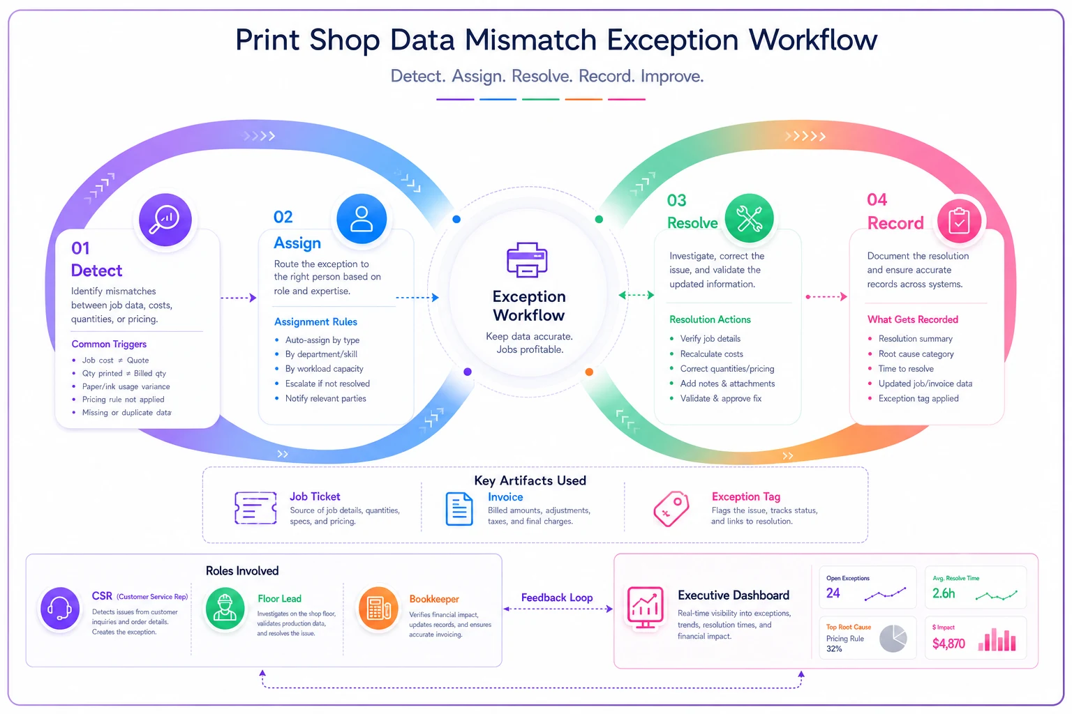
This shows the handoffs, who owns each step, and how the exception tag feeds into trend analysis.
Reconciliation-to-decision mapping
A dashboard number is worthless until it's tied to a decision. This mapping is what separates a reporting dashboard from an operating dashboard. The question for every KPI should be: if this crosses a threshold, what changes?
Here's how some signals map to reconciliation and decisions.
| KPI signal | Reconciliation that backs it | Decision it triggers |
|---|---|---|
| Gross margin on a job type drops below ~30% two weeks running | Weekly job-cost vs. invoice | Re-price that job type or stop quoting it low |
| On-time % dips under 90% | Production vs. quoted due dates | Check for a capacity bottleneck or over-promising at intake |
| AR >45 days climbing | Daily payment matching + monthly aging | Tighten deposit/credit terms, start collections calls |
| Utilization pushing past ~85% for weeks | Scheduling vs. available hours | Hire, add a shift, or raise prices to shed low-margin work |
| Reprint rate creeping up | Production exception tags | Audit proofing/color workflow before it eats margin |
| Conversion falling in one segment | Quote vs. order in quoting system | Review pricing competitiveness or lead quality there |
A KPI with no decision attached is decoration. If you can't name what you'd do when a number goes red, it doesn't belong on the executive dashboard — move it to the operational layer or drop it entirely.
A dashboard wireframe that actually gets used
You don't need a fancy BI tool to start. The layout matters more than the tooling. What works for owners is a top-to-bottom priority flow: what's on fire → am I making money → am I getting paid → am I full.
A simple single-screen wireframe:
-
Top strip — Exceptions & alerts count of open exceptions by category, jobs currently late, invoices past 60 days. Red if anything needs attention today.
-
Row 2 — Profitability gross margin by job type (bar), revenue per production hour (trend line). The money row.
-
Row 3 — Cash AR aging buckets (0–30 / 31–45 / 46–60 / 60+), unapplied payments count.
-
Row 4 — Delivery & quality on-time %, reprint rate, both as trend lines not single numbers.
-
Row 5 — Capacity utilization this week and next, quote-to-order conversion.
Trend lines beat single numbers everywhere it's possible. A 93% on-time this week means nothing. 93% down from 97% last month means something. Owners who only see today's number react to noise. Owners who see the slope react to actual change.
A short real scenario
A commercial shop running roughly $2M a year, about a dozen staff, had "good months" and "bad months" with no real idea why. Their reporting was a month-end spreadsheet the bookkeeper assembled from four sources, and by the time the owner saw it, the month was long gone.
They put in a weekly job-cost reconciliation and a five-metric executive view. Within the first two months the exception tags told the story: a significant chunk of their negative-margin jobs came from one recurring customer whose reps constantly added finishing options mid-run that never got re-quoted. It wasn't a huge number of jobs — maybe eight or nine a month — but it was quietly draining somewhere in the range of a few thousand dollars monthly.
They added a change-order rule and started re-quoting any mid-run spec change. On-time visibility also surfaced that their "bad months" lined up almost exactly with utilization spikes past 90%, where everything ran late and overtime ate the margin. Nothing exotic happened — they just stopped being surprised. The bad months got less bad, and month-end close dropped from most of a day to under an hour.
When this level of governance makes sense — and when it doesn't
When it's worth it: You're past roughly $750k–$1M in revenue, you've got more than a handful of people touching orders, or you're preparing for a loan, a sale, or bringing on a partner. Anytime multiple people record data that feeds one number, you need ownership and reconciliation. If you're eyeing a sale in the next couple of years, start now — buyers discount businesses whose numbers they can't verify.
When it's overkill: A two-person shop where the owner touches every job personally doesn't need formal data ownership — they are the single source. Building elaborate exception workflows for 20 orders a week is process for its own sake. Start with a daily cash match and margin-by-job-type, then add layers as headcount grows.
Who should not do this: Anyone whose underlying order and inventory data is still a mess. A governance layer on top of chaotic records just formalizes the chaos. Clean the core data model first, then put the dashboard and cadence on top of it.
Where software fits
Most of this can start in spreadsheets, and honestly should — proving out your definitions and cadence manually teaches you what actually matters before you automate anything. But the daily and weekly reconciliation is where manual effort breaks down as you scale, because someone has to remember to do it, and busy weeks are exactly when it gets skipped.
This is the natural place for an AI-assisted operational platform to earn its keep: automatically matching payments to orders, flagging jobs whose cost and invoice don't line up, surfacing exceptions with the right category already suggested, and routing each one to the person who owns it. The value isn't a prettier chart — it's that reconciliation happens even during your busiest week, and the exception tags accumulate into patterns you'd never spot manually. The dashboard stays trustworthy because the checking underneath it never quietly stops.
The goal, either way, is the same: a small set of numbers an owner can act on, each one owned by a person, each one checked against reality on a rhythm, and each one tied to a decision. Get that right and your dashboard stops being a report you glance at and becomes the thing you actually run the shop with.
The goal, either way, is the same: a small set of numbers an owner can act on, each one owned by a person, each one checked against reality on a rhythm, and each one tied to a decision. Get that right and your dashboard stops being a report you glance at and becomes the thing you actually run the shop with.
Ready to simplify your print shop operations?
Join 500+ print shops using GoInkly to save time, reduce errors, and improve customer satisfaction.